House Of Circles
2019 | Visual Design | New York | Duration: 2 hoursProject introduction
"House of Circles" is an exercise I did to practice what is going to be when working in a team and being in charge of a specific task.
It is also a challenge for me to come up with ideas in a short period.
I also practice how to write about my idea (aka sell my idea) and talk about the reason and process behind my decision making.
Project Goal
Build a 5 color palette and apply it to a site design for The Sticker House.
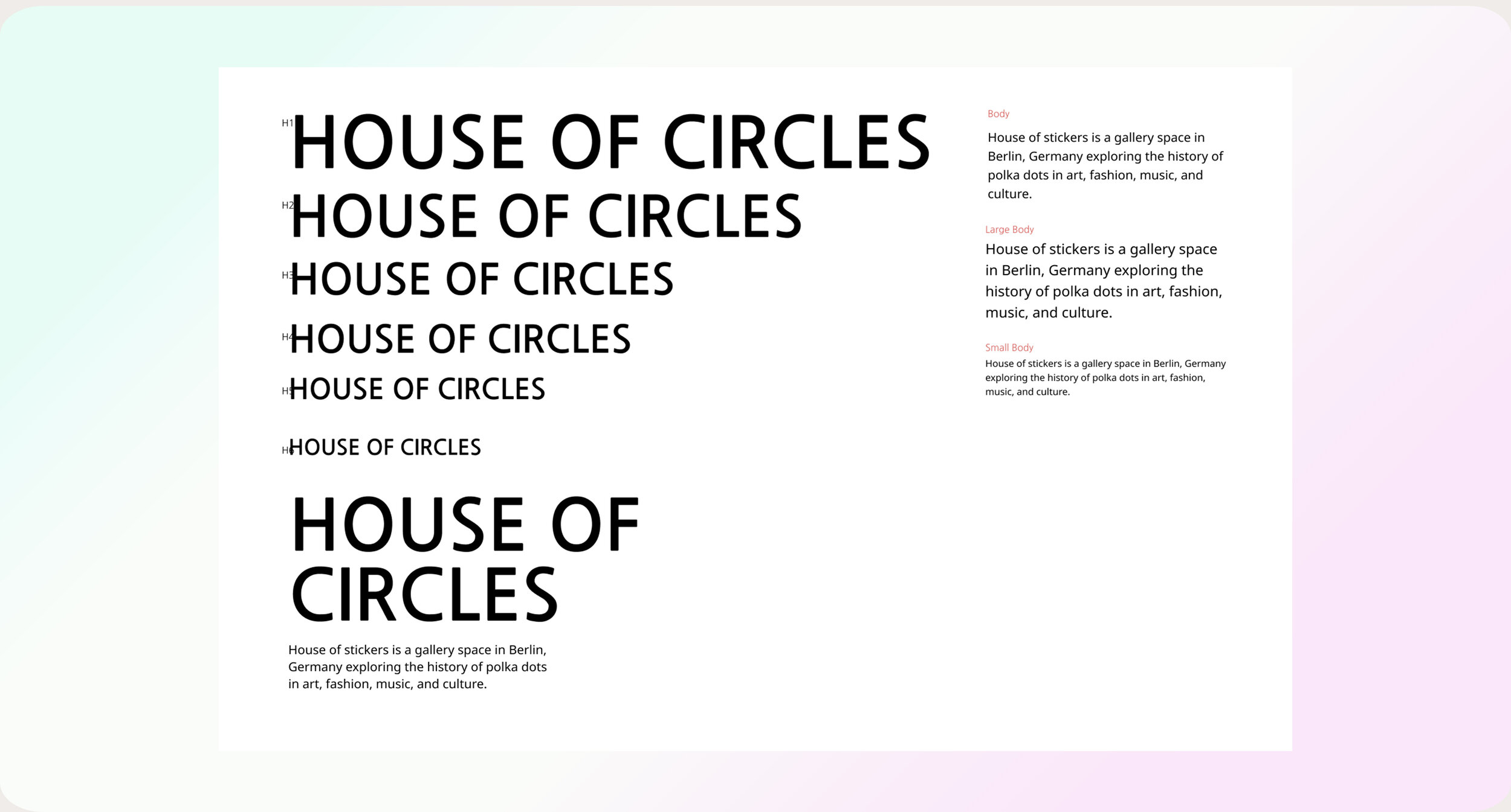
Choose fonts
Both type and color considerations are required to pass accessibility testing.
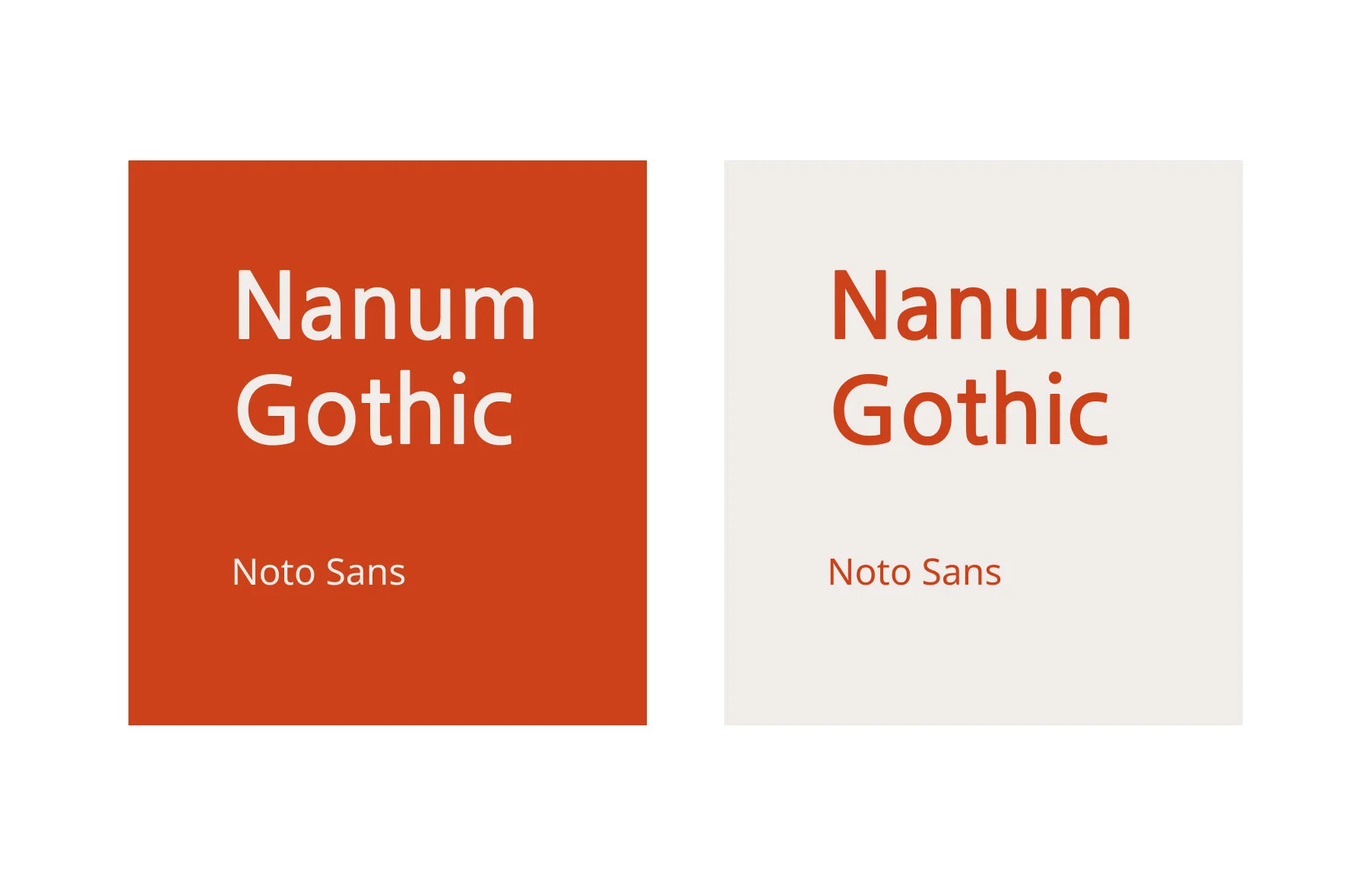
Typeface Pairing
Nanum Gothic
Noto Sans
Reason
The "O" in Nanum Gothic works well with our circles. Noto Sans is a beautiful font that is easy to read. These two fonts together show the friendliness of our brand.
Color Story Inspiration
Color and Font | Pairing 1
Color and Font | Pairing 2
Color and Font | Pairing 3
Color and Font | Pairing 4
Layout Prototype For Web
Final Prototype with New Typeface and Color
Layout for Mobile
Final Prototype for Mobile
Take away
Typeface and color set the tone of a brand.
There are times when I thought two colors would work well together but forgot to check legibility.
My workflow has been improved when I set up the typeface and color before I was applying them.
reflection
The hardest part of this project is talking about the typeface. There are a lot of fonts I need to get familiar with.
Naming colors is fun, but I need to read more to expand my vocabulary.


